Consideration #1:
The Goal of Your Signage

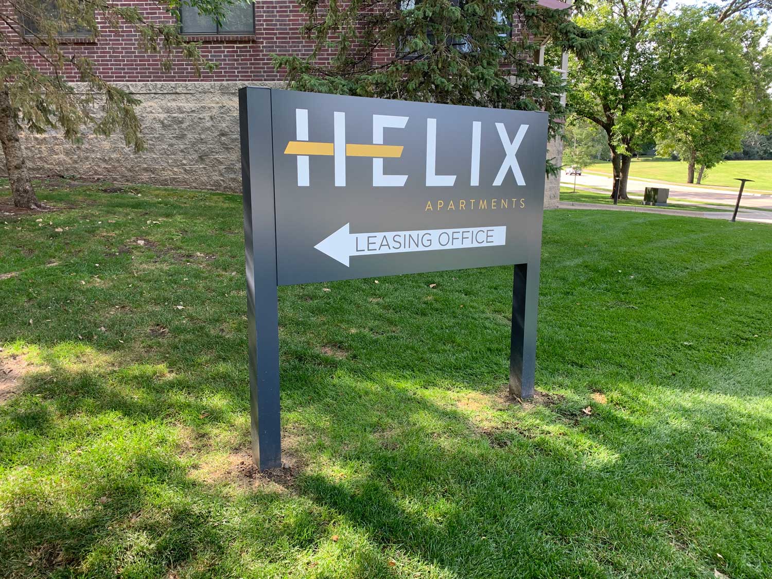
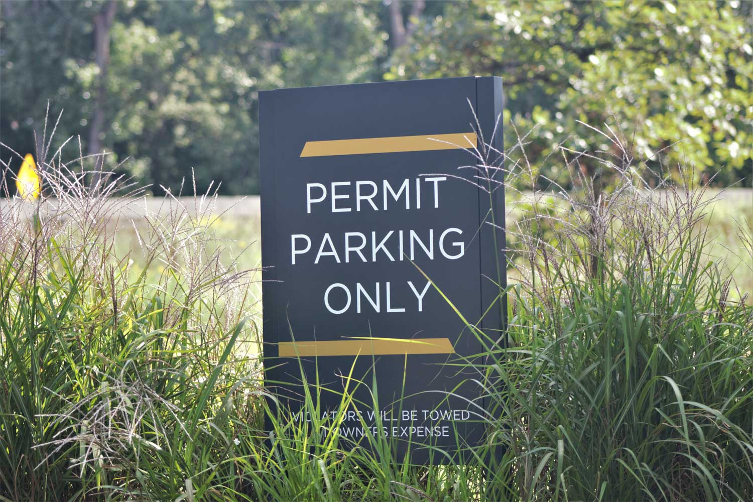
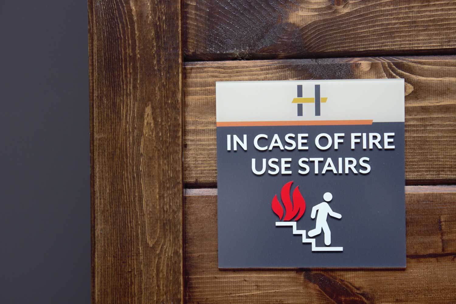
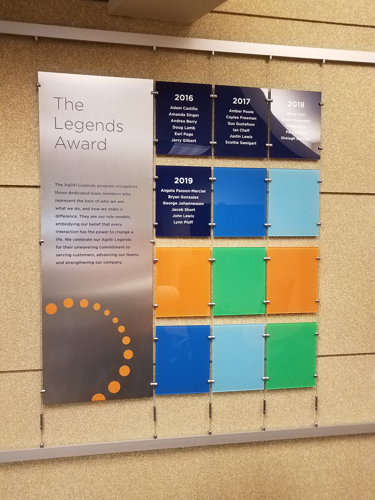
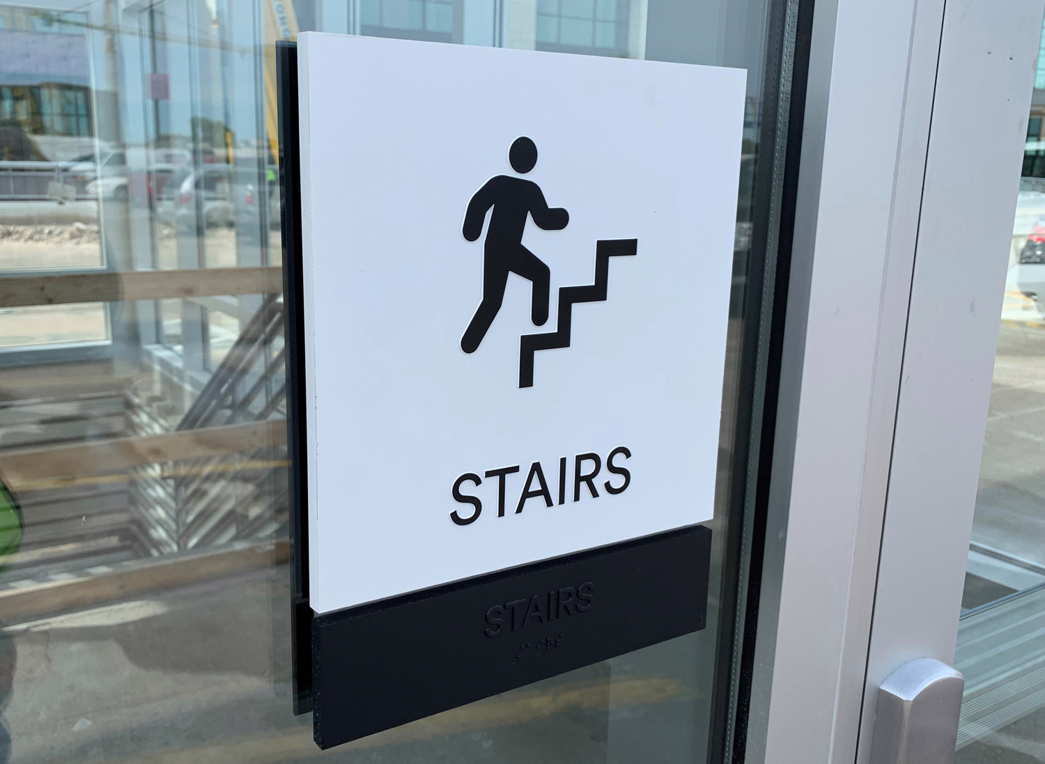
Start your journey by identifying what specific thing you want your sign to do. Do you want it to help raise brand awareness? Increase sales? Help people find their way? Make the area safer or more secure? Help build community? Add fun flair to the space? Be ADA Compliant?
Consideration #2:
The Content on Your Signage

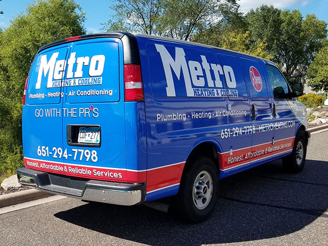
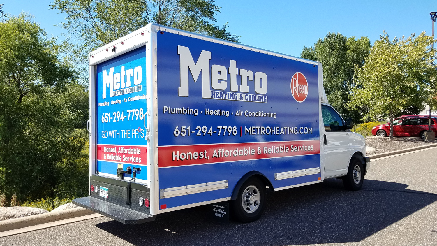
Keep it concise and relevant to your specific goal. For example, if your main goal is to increase call volume, make sure the phone number is front and center and clearly visible.
Common Elements Often Used In Signage
- Business Name
- Logo
- Tagline
- Phone Number
- Website
- Primary Services
- Social Media Icons
- QR Codes
- Relevant Photos or
Design Elements
Consideration #3:
The Location and Readability
of Your Signage

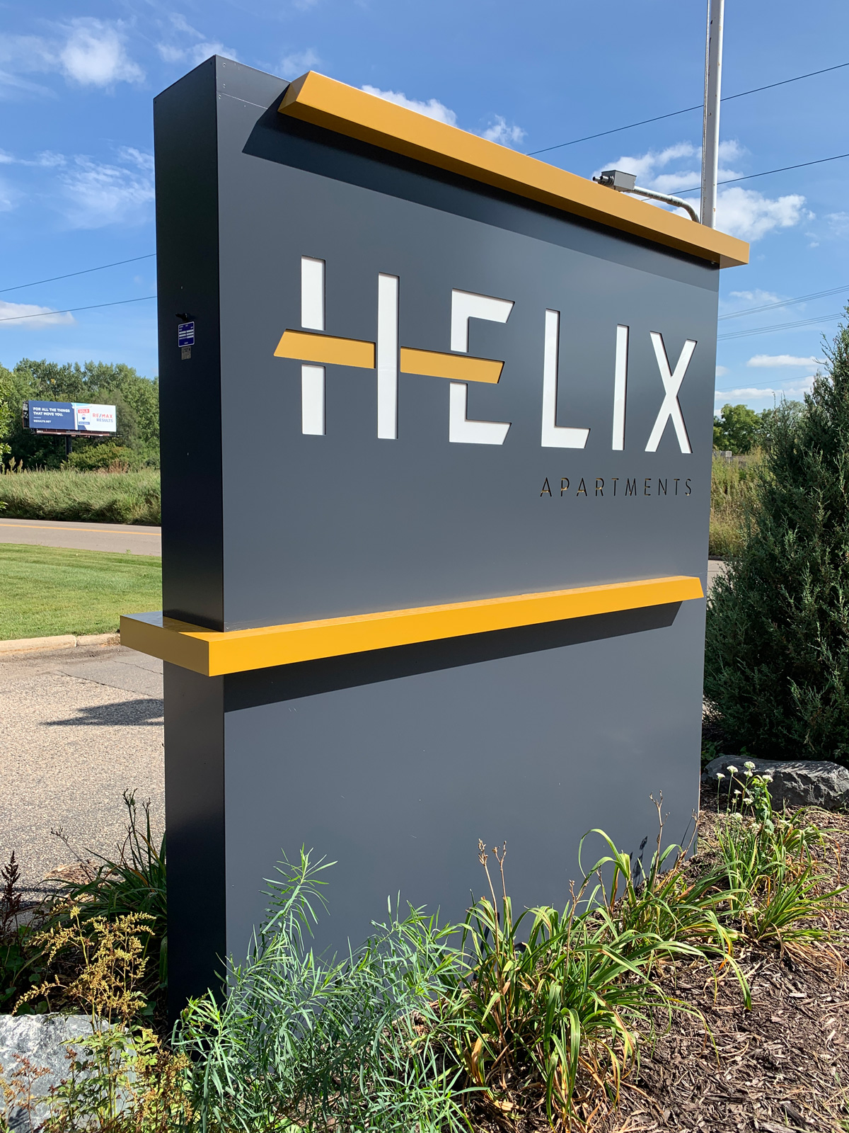
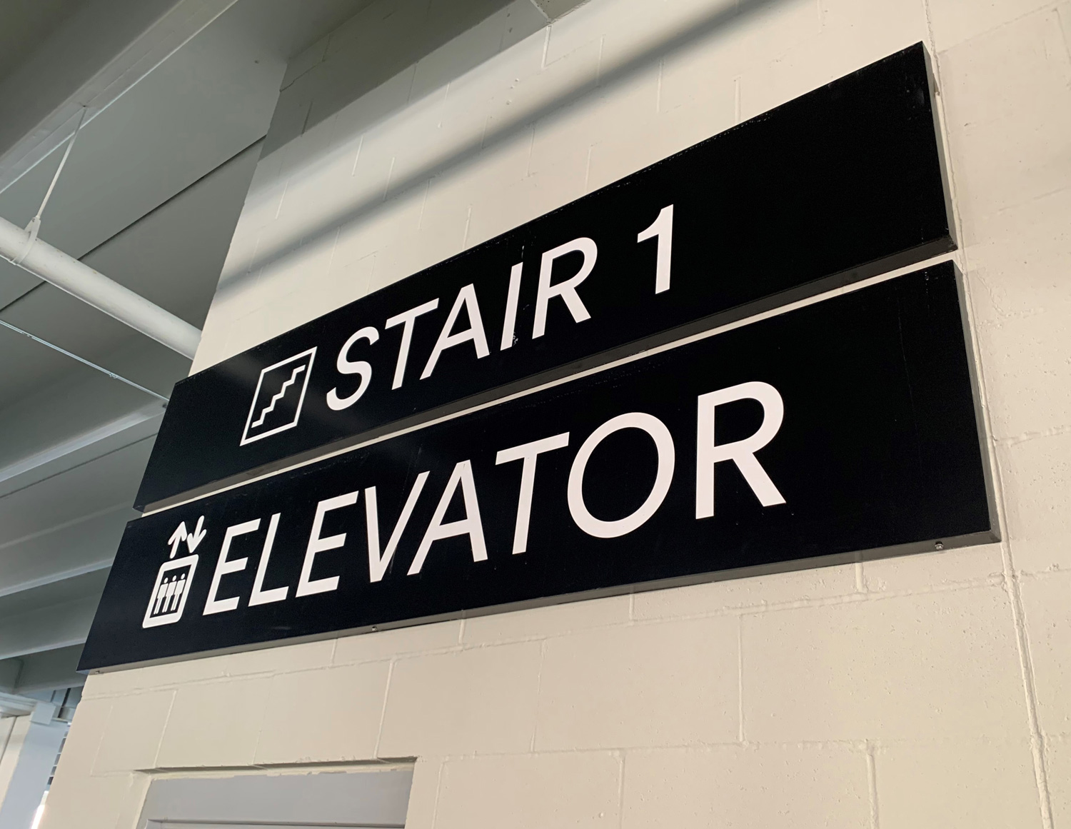
Where will your sign go? Will it be indoors or outdoors? And, how big will it need to be to be seen by those passing by? Determining letter height will help determine what type of sign you should get and what information can be included on your sign.
As a rule of thumb, 1-inch-high letters provide approximately 10ft of readability.

Consideration #4:
The Colors and Fonts
on Your Signage

If you already have a developed brand look and feel, it is best to go with fonts and colors already established when possible. Some fonts and colors may need to change depending on the readability, fabrication limitations, or city zoning regulations. If fonts or colors have not yet been determined, it may be simplest to go with a clean, easy to read modern font to give you maximum readability and colors that best represent the type of services you offer. Learn more about brand color psychology here.

Looking for inspiration? Learn more about our most popular offerings.
Let’s tackle your next signage
project together.
Make purchasing custom signage a stress-free experience.


