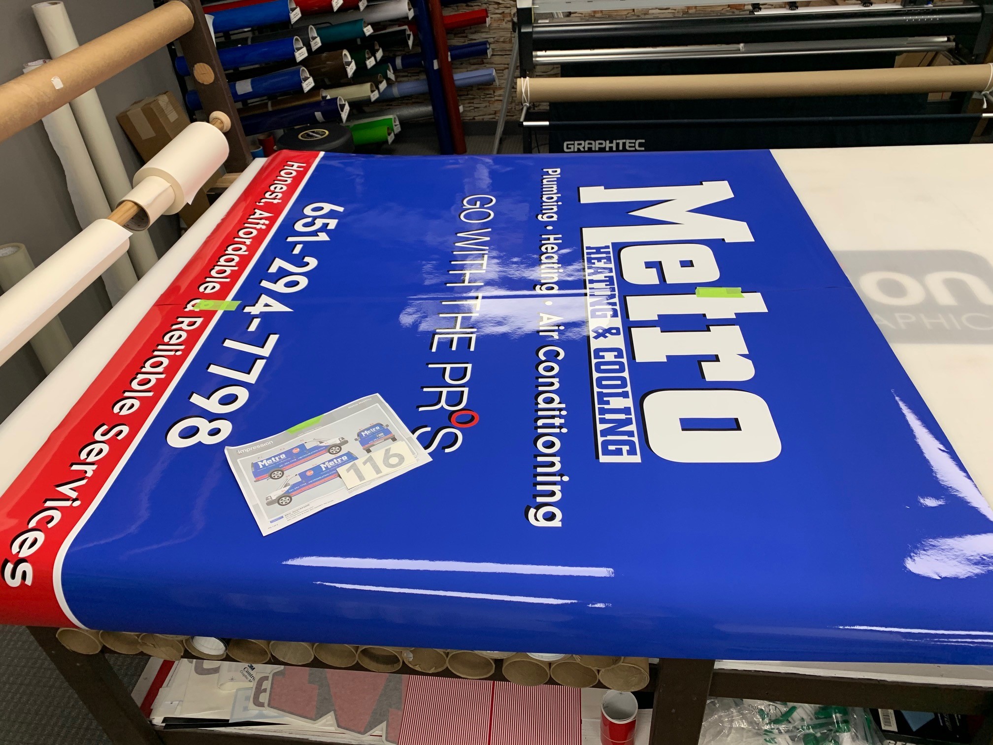
Graphic Design / Logo Design
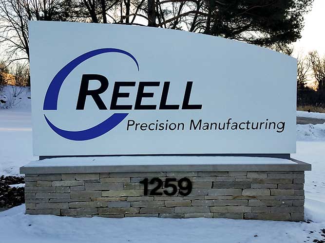
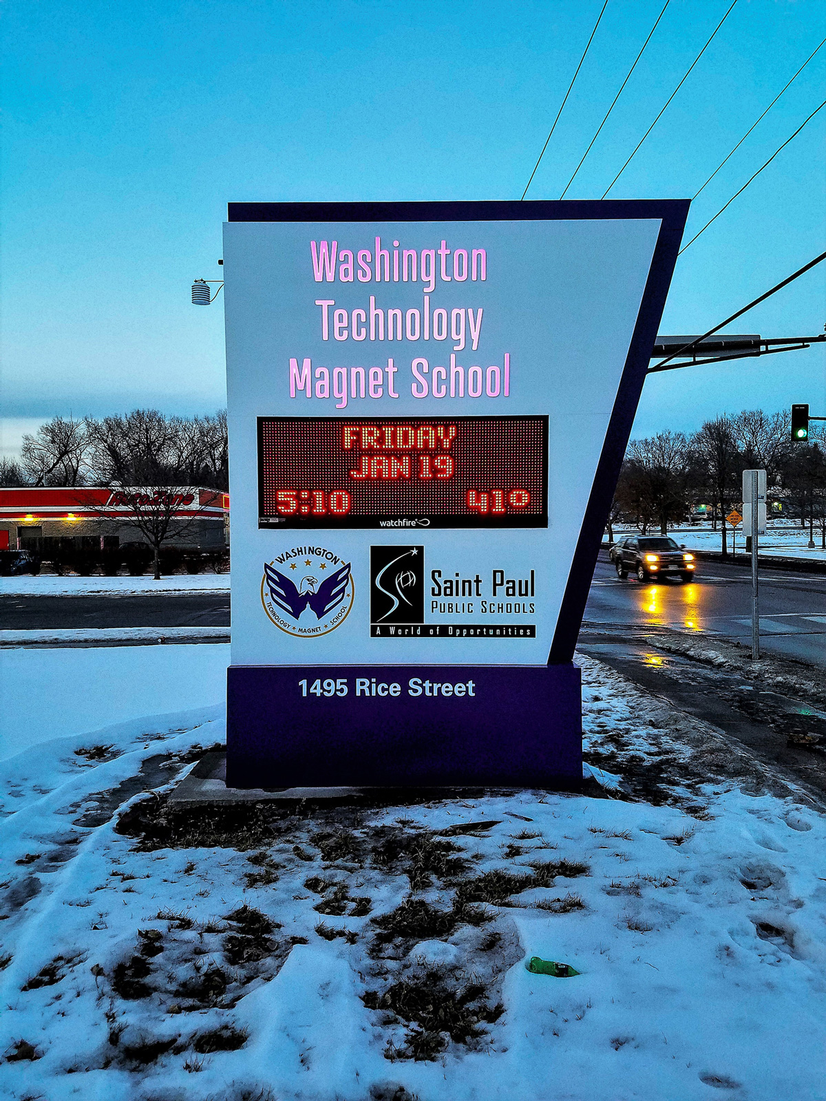
Effective sign design can be hard to find. We work to provide ideas that maximize the impact of your signage budget and take full advantage of the local sign codes.
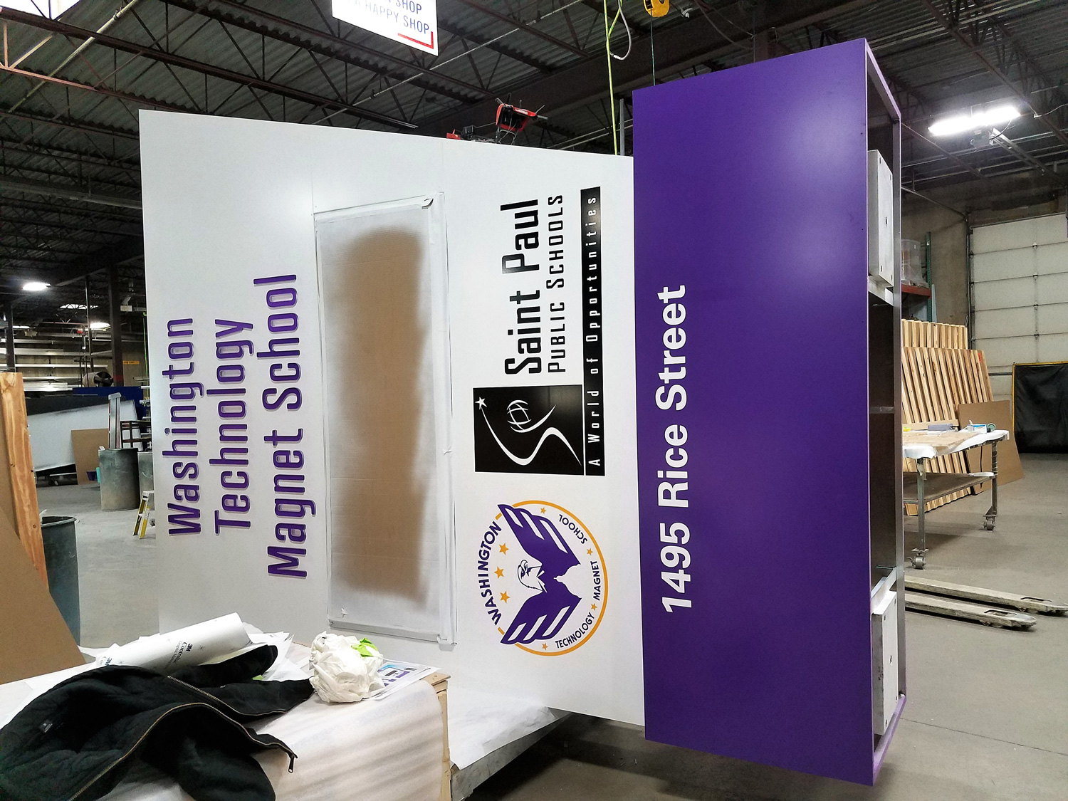
Our staff of professional designers will thoroughly learn about your company's needs and brand rules to try to help you formulate a concrete vision before designing anything. The design process is very important, from conceptualization to production and we are thrilled to be a part of bringing your ideas to life.
Proudly serving clients in the Twin Cities (Minneapolis and St. Paul), greater Minnesota and nationwide. Our convenient Oakdale location is just minutes from Woodbury, Cottage Grove, Newport, Inver Grove Heights, Eagan, Mendota Heights, Maplewood, Vadnais Heights, White Bear Lake, North St. Paul, Lake Elmo, West St. Paul, South St. Paul, Mahtomedi, Stillwater, Hastings and Roseville.
11 Quick Tips for Effective Signage Design
- 1. Keep it visible and legible.
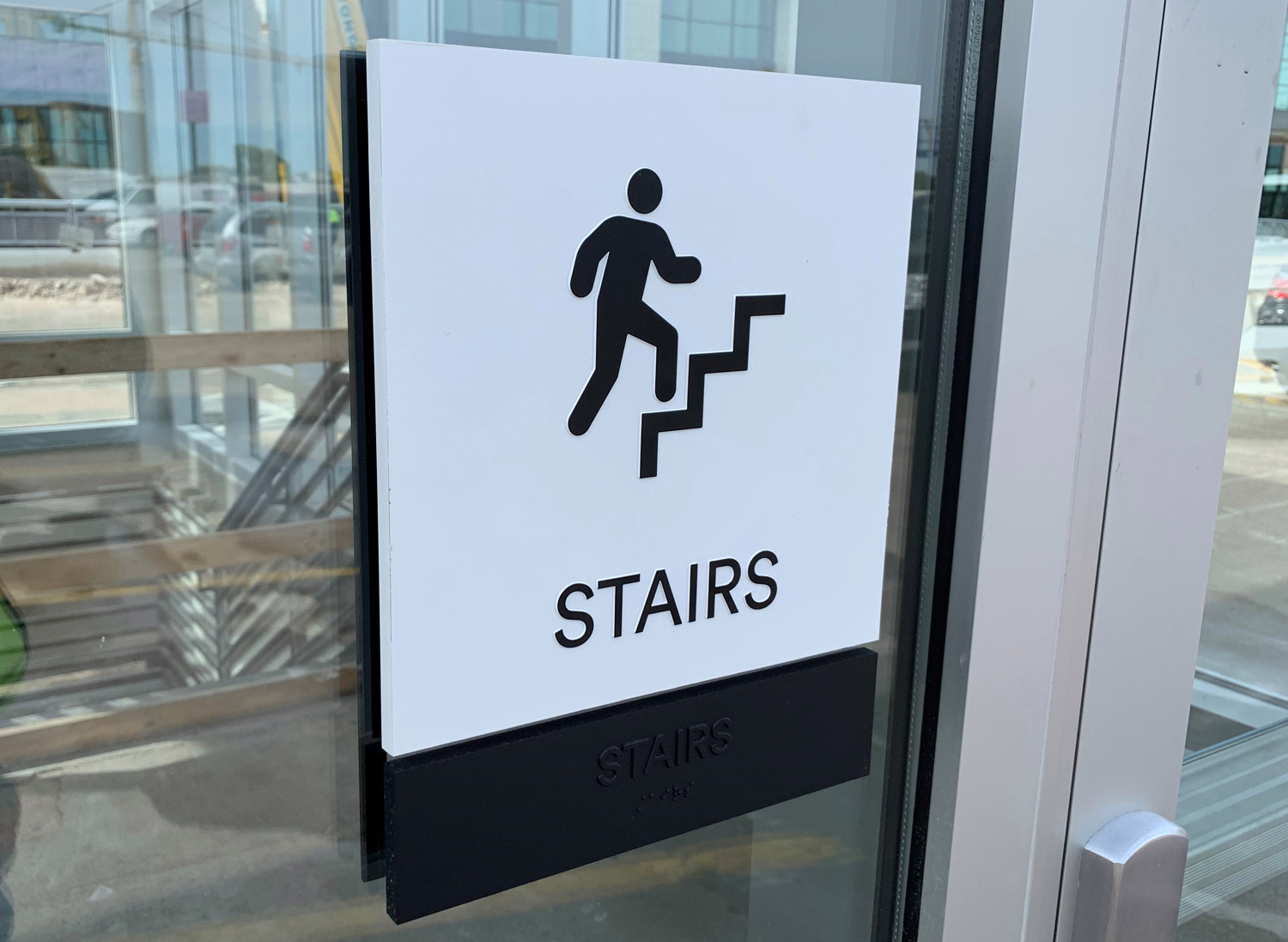
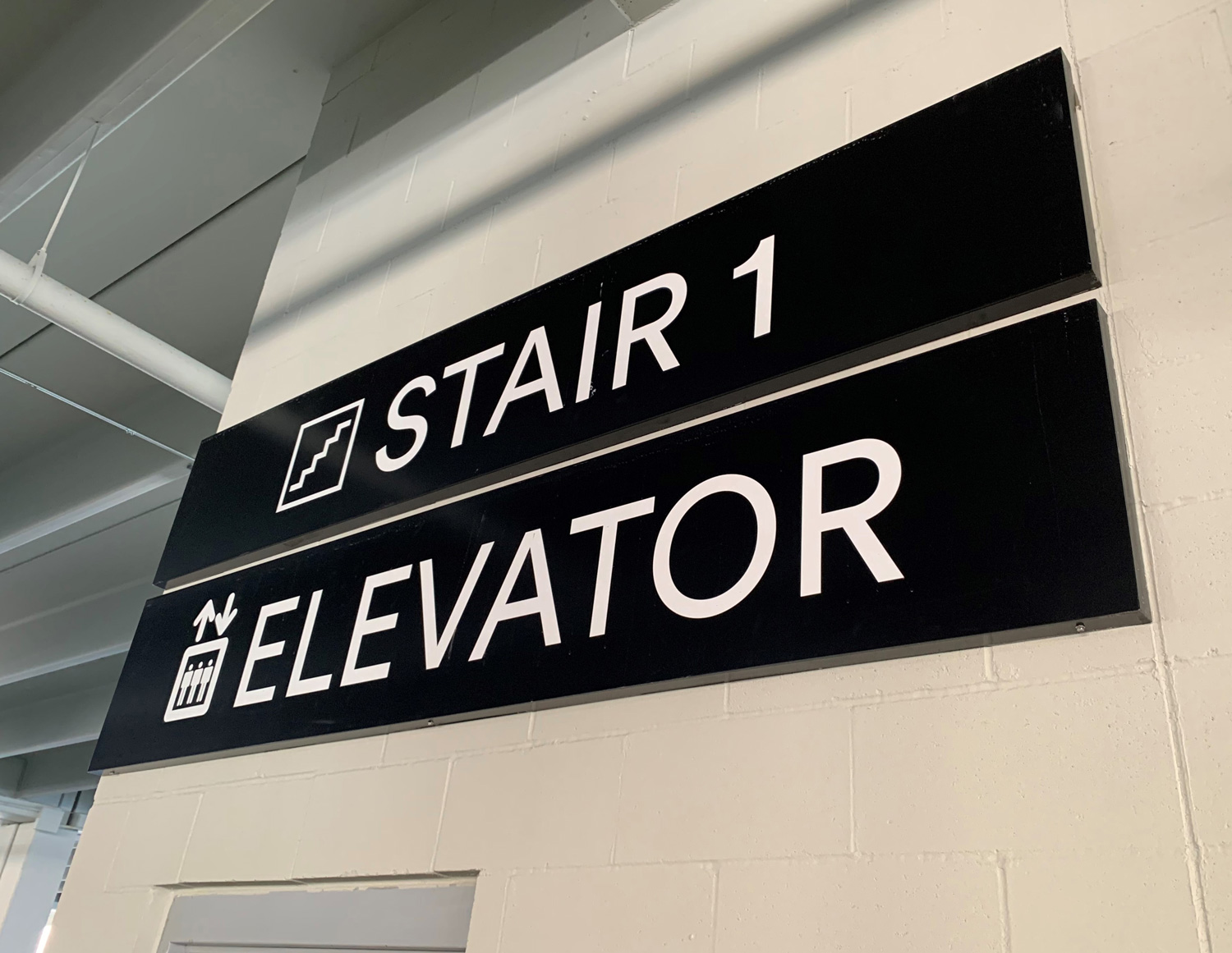
Remember that people of all ages are reading while looking through a windshield, in traffic, day and night. They must be able to see and read your client's sign quickly and easily. Sans serif fonts are helpful for fast legibility. - 2. Save the details for the sale.
Don't attempt to sell with information on the sign. Tell your client to save that information until the customer has set foot in the business. - 3. Keep it simple.
Crowding the sign with too many words or lines of text makes it impossible to read from a distance. Three to five words are optimal for quick readability. Also, make sure the letter kerning is not too tight. - 4. Grab attention.
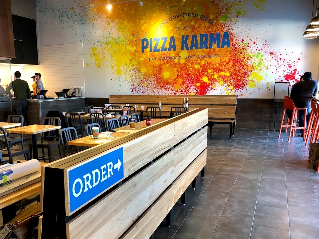
There should be something about the sign that will reach out and command attention. Ideally, the first item should be a large pictorial graphic or your customer's company logo, but it can also be large dominating text. Strong color contrast can help as well. - 5. Appeal to impulse buyers.
Many clients mistakenly think of a sign as merely a device that identifies the business. What they fail to realize is that 55% of all retail sales are a result of impulse purchases. This makes it imperative that the sign quickly communicates what the business sells. - 6. Keep it near the viewer.
Put the sign as close to the street as is permitted. - 7. Make sure your sign is conspicuous.
Your client's message competes in a complex environment. A passerby must be able to differentiate your sign from its surrounding environment. A strong contrast to the building facade (and an easily legible font) is helpful. - 8. Avoid obstructions.
Make certain the sign can be viewed without obstruction from any source. Drive past your client's business from all directions to help determine the most visible sign location(s). - 9. Make it memorable.
Your sign should make your client's products or services, and location, easy to remember. "Just look for the big red sign near the intersection of Alameda and Bennington." - 10. Consider colors carefully.
Too many colors take away from the quick readability of the sign. Again, stay simple. Make sure colors are contrasting. Yellow on white is not very readable, whereas black on white is easily readable. - 11. Consistent visual image.
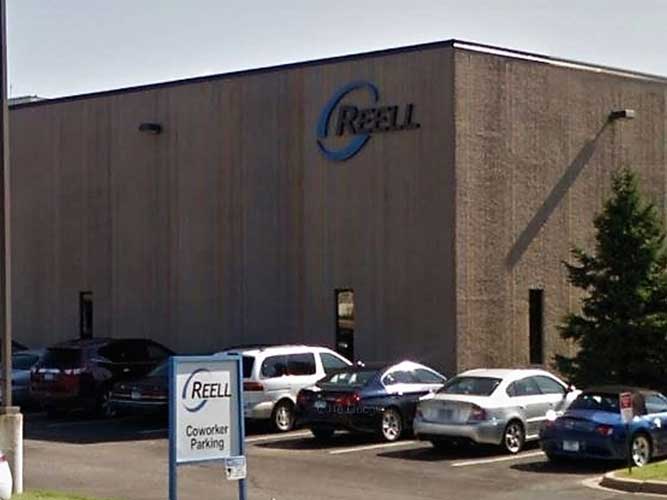
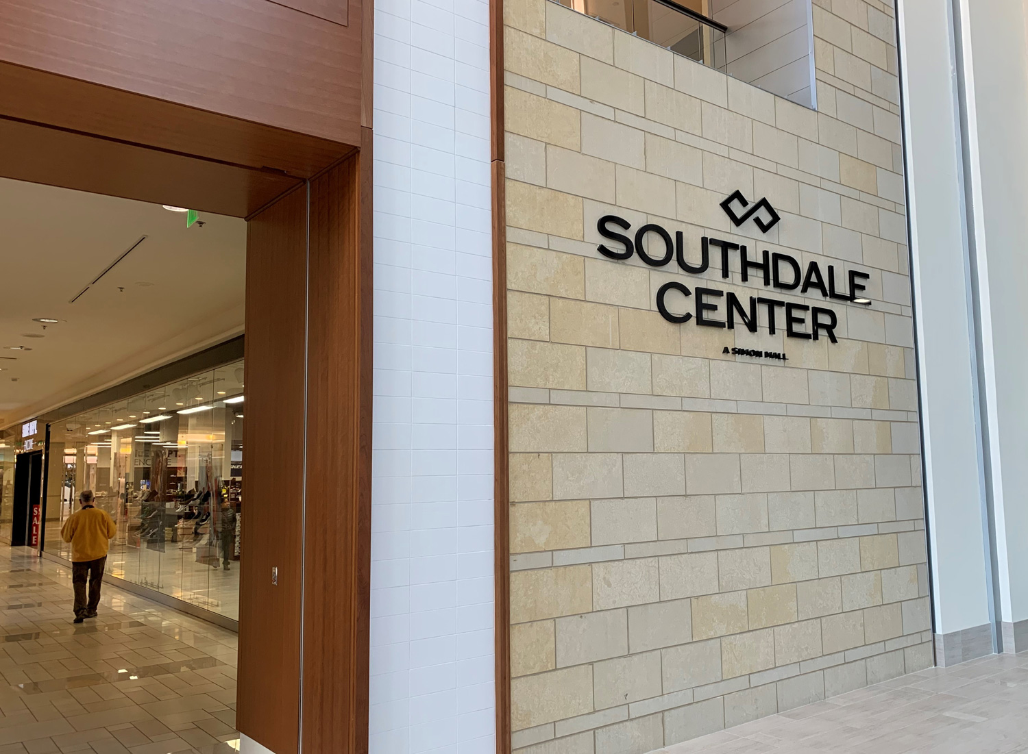
Ideally, the design and the colors of your client's building should reinforce the design and colors of your sign (or vice versa). Color is probably the easiest and most cost-effective device for this coordination of design for business identification.
*Source - SBA "Design Tips" within "Understanding the Value of Signage."
Looking for something special?
As your full-service sign shop, we can handle any request big or small. Contact us today!


